5 Store Layouts That Lift Conversion
Match your retail store layouts to one of five proven patterns to lift conversion. If you want expert help planning your next store, explore our retail interior design services. Grid gives predictable high-traffic flow, loop guides exposure, free-flow boosts discovery, herringbone or spine work for narrow spaces, and a mixed boutique layout supports higher AOV. Pick based on traffic, product mix, and brand story, then apply the tactics below.

Layout Snapshot: Retail Store Layouts That Convert
- Grid layouts suit high SKU density and repeat trips, using parallel aisles and endcaps to drive reliable flow and promotions.
- Loop layouts guide shoppers on a clear path that increases exposure to categories and endcaps, ideal for storytelling and multi-category concepts.
- Free-flow layouts create open vignettes that raise dwell time, discovery, and impulse buys in boutiques and experiential formats.
- Herringbone and spine layouts work best in long, narrow stores where clear sightlines and a central axis keep navigation fast and focused.
- Mixed boutique layouts combine a base structure with curated pockets that lift engagement and average order value through bundles and premium sets.
Each of these retail store layouts changes how shoppers move, pause, and decide, so the match matters more than the décor.
Quick Comparison
| Layout | Best for | Watch-outs | KPI to watch |
| Grid | High SKU density, repeat trips | Monotony, aisle fatigue | Units per visit, aisle heatmaps |
| Loop (Racetrack) | Storytelling, full exposure | Slower quick trips, bottlenecks | % full-path traversal, endcap CTR |
| Free-flow | Boutiques, experiential small formats | Wayfinding confusion if over-open | Dwell time, add-on rate |
| Herringbone | Long and narrow footprints | Disorientation if angles are aggressive | Exposure per sq ft |
| Spine | Clear wayfinding across sections | Under-utilised side aisles | Time to key categories |
| Boutique mixed | Premium positioning and bundles | Fragmented visibility without clear anchors | AOV, bundle attach rate |
Grid Layout: Predictable Paths for High-Traffic Retail
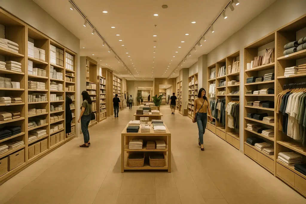
Among retail store layouts, a grid layout works when you need reliability at scale. Parallel aisles create a rhythm that most shoppers understand instantly, so navigation becomes almost automatic. This lets you place staples deeper in the store without annoying regulars, while endcaps and eye-level bays handle the heavy lifting for promotions and high-margin items.
If long runs start to feel monotonous, break them with a focal display at intersections, vary shelf heights in select stretches, and use a short decompression zone at the entrance so people settle before their first decision. Keep signage consistent from department to category to offer so the journey feels effortless instead of over-directed. For most high-SKU formats, a grid store layout is the safest path to steady conversion and predictable replenishment.
Loop (Racetrack) Layout: Guided Circulation for Exposure
A loop layout engineers a purposeful journey. Customers follow a clear path that reveals categories in sequence, which is ideal for storytelling brands and multi-category concepts. Start broad at the entrance and narrow into specific themes as the route unfolds. Use lighting gradients to pull attention forward and place the most profitable or new categories just after natural slows in the path.
The risk is friction for mission shoppers who want one or two items. Build in visible shortcuts, mark an express route, and signal exits clearly. Watch for bottlenecks at tight turns and widen those points or trim fixture depth to keep the loop moving. Done well, a racetrack layout gives comprehensive exposure without feeling like a forced march.
Free-Flow Layout: Discovery and Impulse Buys
Free-flow turns the store into a gallery, which is powerful for boutiques and experiential retail. Instead of rigid aisles, you curate islands and vignette tables that invite wandering. Anchor sightlines so there is always something obvious to move toward from the entrance, then layer smaller discoveries at natural pauses near fitting rooms or checkout. Clustering complementary items near those pauses is a simple way to lift add-on rate.
Rotate displays on a fixed calendar so novelty stays high but the space never feels random. Use subtle floor contrasts, vertical markers, and mirror placement to keep casual exploration from turning into confusion. The result should feel intentional, premium, and fresh, with discovery translating into higher dwell time and impulse purchases.
Herringbone and Spine Layouts: Clear Sightlines and Fast Navigation
Spine and herringbone layouts are workhorses for long, narrow footprints. A central spine sets a clean axis from entrance to focal zones. Off that spine, angled aisles in a herringbone pattern increase exposure on both sides and help short stores feel deeper and more dynamic.
Keep angles consistent and aisle widths measured so the pattern reads as a design choice rather than a maze. Place endcaps at spine intersections to pull shoppers across categories, and put small, high-velocity items at the join points where angled runs meet the main corridor. If first-time visitors seem disoriented, reduce the angle slightly, simplify signage, and add a visible return path at the back wall so there are no dead ends. Used together, a spine for clarity and herringbone for visibility can deliver fast navigation with strong exposure per square foot.
Boutique (Mixed) Layout: Curated Zones for Higher Average Order Value
A mixed layout borrows the navigational confidence of grids or spines, then inserts boutique pockets that feel like mini showrooms. Each pocket tells a tight story, which makes bundling and premium sets feel natural rather than pushed. Keep the global palette and lighting consistent so zones feel connected to the whole store, and position anchors so hero SKUs remain visible from core circulation.
Limit the number of micro-themes at any one time, refresh them on a calendar, and use clear price ladders to guide shoppers to upgrades without pressure. Mixed layouts shine when you want everyday efficiency and premium moments in the same footprint, which is often the most realistic way to lift average order value.
Implementation Playbook
- Give shoppers a small decompression area at the entrance, then place a strong focal point a few steps in to set pace and cue the first decision.
- As they move deeper, use endcaps with one clear offer, a large price card, and an obvious benefit. Add small speed bump displays before major category changes to slow traffic just enough for discovery without clogging aisles.
- Keep a simple signage hierarchy that repeats from zone to zone so people never have to think about how to read your retail store layouts.
- Layer lighting: ambient for comfort, task for work areas, and accent for hero bays, new arrivals, and bundles.
- Put cross-merchandising as close to the decision as possible: accessories near core items, complementary SKUs near mirrors or try-on points, and bundle prompts where a shopper naturally pauses.
30-Day Testing Plan
Week 1: Record a baseline
Capture heatmaps, pathing, and the KPIs that matter most for your format: dwell time, units per visit, add-on rate, time to key categories, and AOV. Identify dead zones and congestion points with photos and timestamps so you can repeat the test later with the same reference points. This gives you a clean baseline to compare how different retail store layouts actually perform.
Week 2: Make a few high-impact changes
Move or add a small number of endcaps, adjust two or three speed bumps, and refresh your most visible vignettes. Align accent lighting with the updated focal points and keep notes on exactly what changed.
Week 3: Review and refine
Compare the new data against your baseline. Keep the winners, roll back the losers, and test one alternative layout or configuration for each underperformer. Avoid changing too many elements at once so you can read which adjustment produced which effect.
Week 4: Lock in and create a refresh rhythm
Lock the winning configuration and codify a monthly refresh schedule. Plan seasonal capsules, endcap rotations, and vignette swaps in advance so the store evolves consistently without last-minute scrambles. For inspiration, review similar retail design projects to see how other stores structure their layouts.
In each test cycle, keep the focus on how your retail store layouts affect dwell time, AOV and time to key categories.
Retail Store Layouts FAQ for Conversion
What are the main store layout types?
The main types are grid, loop or racetrack, free-flow, herringbone, and spine. Many retailers use a mixed store layout that blends two or more to balance efficiency and experience.
Which layout increases conversion the most?
It depends on your format and goals. Grid is strong for high-SKU efficiency, loop improves full-path exposure and impulse, free-flow deepens brand engagement in smaller spaces, and mixed layouts often lift average order value through bundling and premium sets.
What is a racetrack layout in retail?
It is a guided loop that routes shoppers past curated zones and endcaps while still allowing shortcuts for quick missions. Shoppers get broad exposure without feeling trapped.
Is free-flow good for small shops?
Yes, if wayfinding is preserved. Keep visible anchors from the entrance, use subtle floor or vertical cues, and ensure a clear path to checkout so browsing feels intuitive rather than confusing.
How do I choose the right store layout?
When choosing retail store layouts, match your layout to traffic patterns, footprint, SKU density, brand story, and staffing model. Test changes with heatmaps and track dwell time, AOV, add-on rate, and time to key categories before you roll anything out across all locations.
Final Word: Design the Journey
Choose the retail store layouts that fit your traffic and assortment, then refine sightlines, focal points, and endcaps until the data shows the journey feels natural. Track dwell time, average order value, units per visit, and exposure to priority categories. Review the numbers monthly and keep iterating. Small, disciplined changes compound into higher conversion.
Want a second set of eyes on your floor plan? Book a 20 minute layout review or a full layout audit with the team


